Transforming Rezolve's Self-Service Portal

Introduction
Rezolve, a mobile engagement platform, partnered with Acknowledgement to redesign their Self-Service Portal. The aim? To enhance usability, simplify user journeys and create a platform that resonates with their two key audiences: small merchants and marketing specialists.
The challenge
The Self-Service Portal is a critical tool for Rezolve's clients allowing them to create and manage their mobile engagements. However, the diverse needs of the two main user types - small merchants and marketing specialists - presented unique challenges:
Small merchants: Primarily concerned about cost and results, less familiar with online marketing tools and likely to access the portal via mobile.Marketing specialists: Desire more analytics and controls, are familiar with other online marketing control panels and likely to access the portal via desktop.
The redesign needed to cater to these distinct user profiles while achieving several key objectives:
Communicate the possibilities and results that Rezolve offers.
Explain the types of engagements and associated pricing.
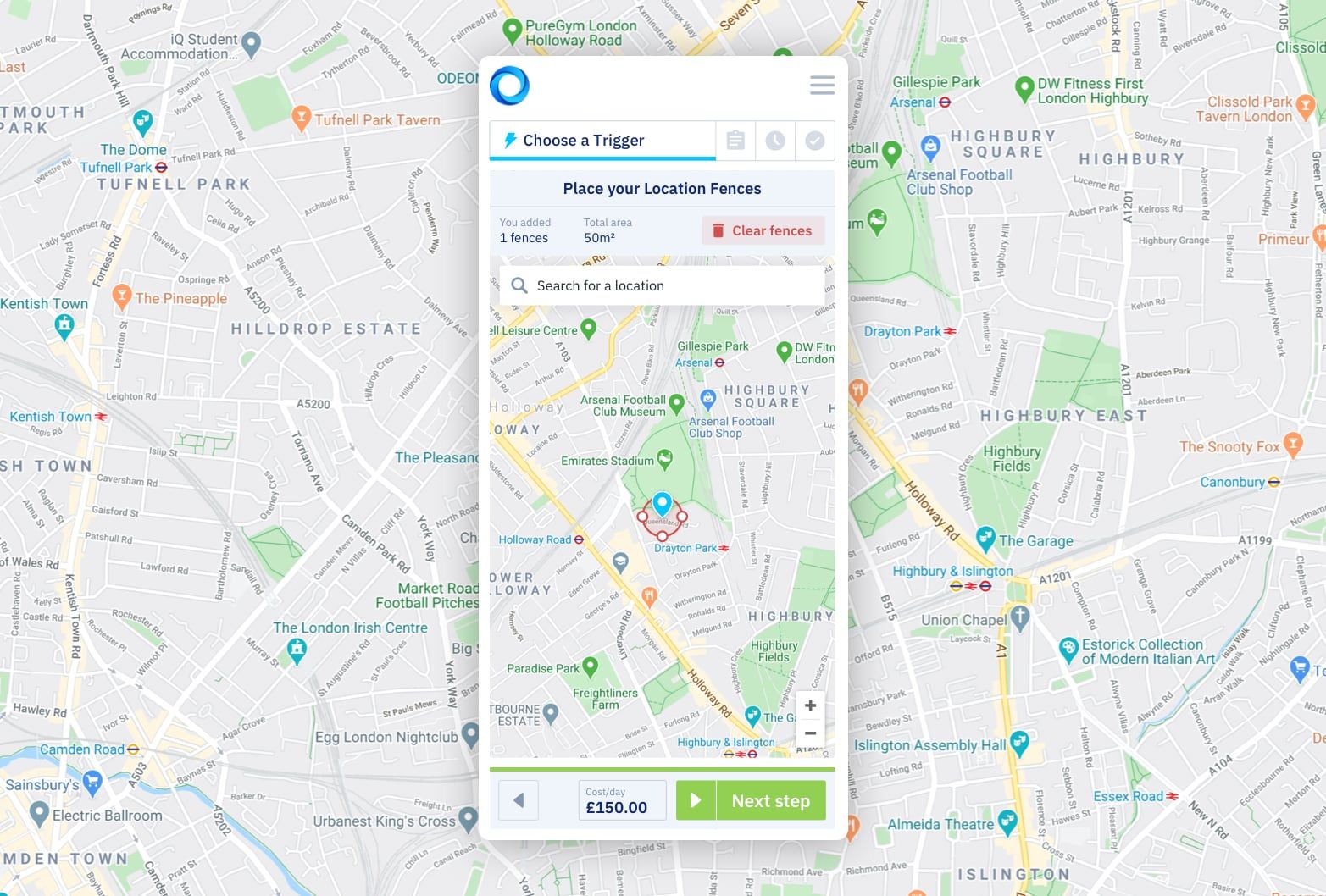
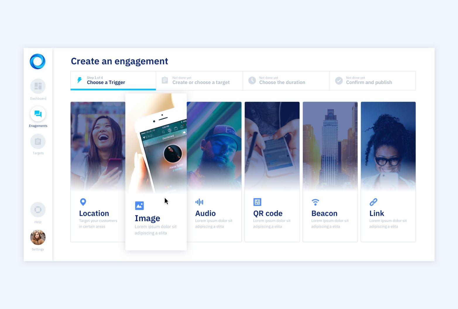
Guide users through the engagement creation process.
Preview engagements and offer contextual help.
Upsell spend and commitment where possible.
Our approach
Initial discussions and proposals
We began with in-depth discussions with Rezolve's stakeholders to understand their vision and requirements. Acknowledgement then presented key screens with the proposed changes demonstrating our approach and thinking.
Iterative design process
Understanding that design is an evolving process, we iterated the screens in response to feedback. This ensured that the design was aligned with Rezolve's goals and user needs.
Final layouts, views and states
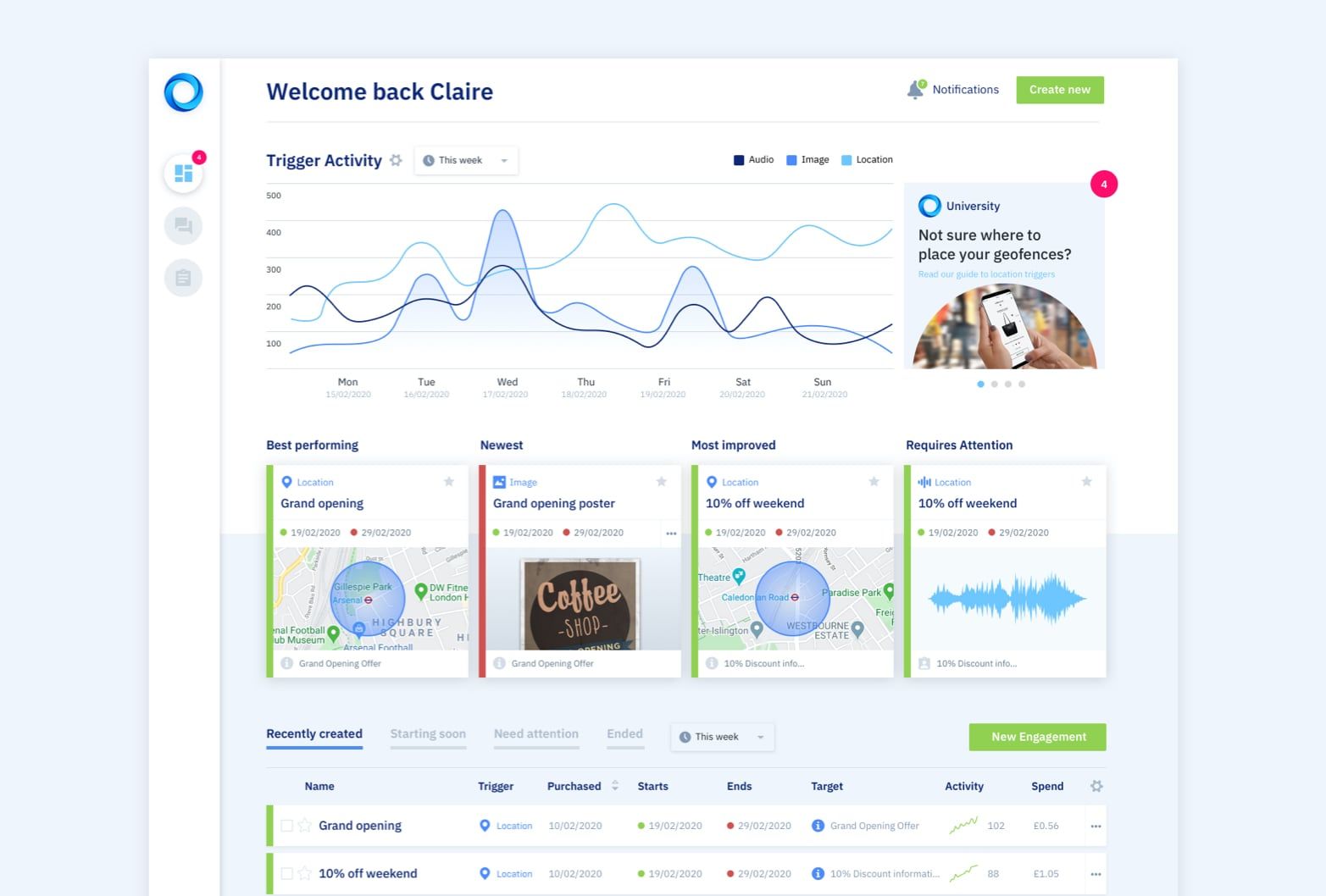
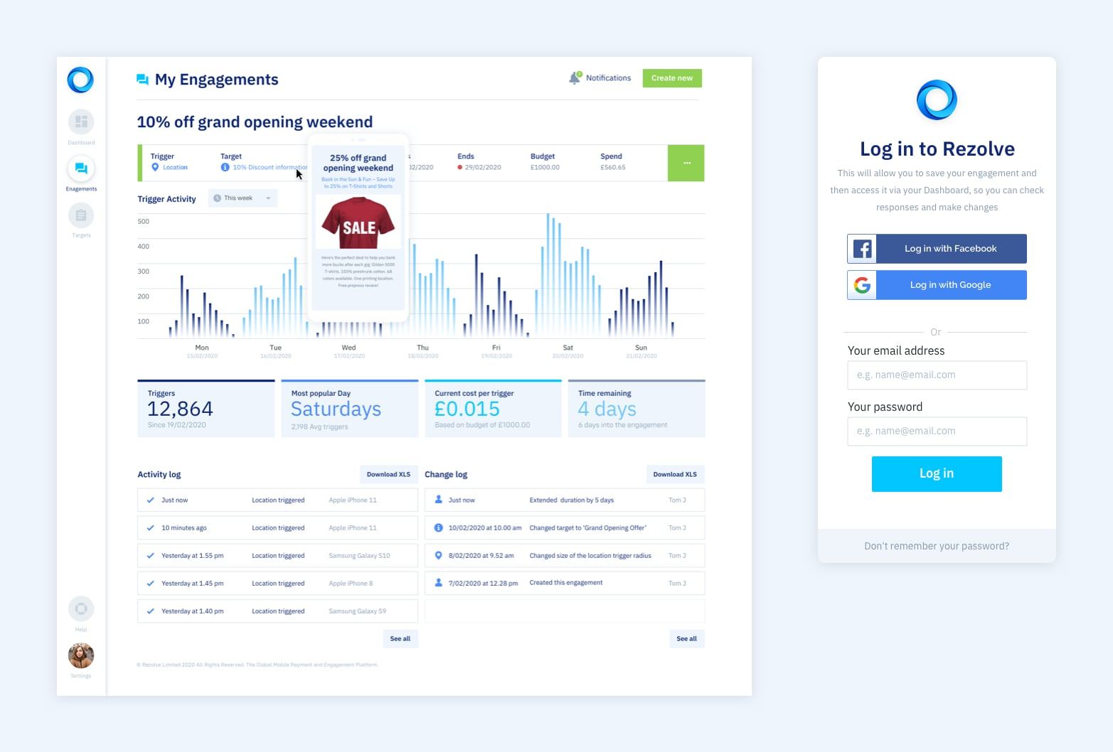
Following agreement on the direction, we laid out all core screens (and associated states) in both desktop and mobile views.
Deliverables
Initial concepts: The foundation of our design approach showcasing a new visual language
Refined concepts: Two rounds of iterations to fine-tune the design.
All screens: Two rounds of iterations to perfect the layout.
Clickable prototype: Created via Invision for a hands-on experience.
Sketch files: To supply to technical team at Rezolve for build
Guidelines document: To ensure future consistency and clarity.
Conclusion: a happy client!
The redesigned Self-Service Portal was met with enthusiasm and satisfaction from Rezolve. The platform design now not only reflects the brand's value proposition but also offers an intuitive and engaging experience for its diverse user base.
At Acknowledgement, we believe in collaboration, innovation and meticulous attention to detail. This project was a testament to our commitment to delivering excellence and we are proud to have contributed to Rezolve's success.
Interested in transforming your digital platform? Contact us today to see how Acknowledgement can make it happen!